
Text heavy web service and Typography

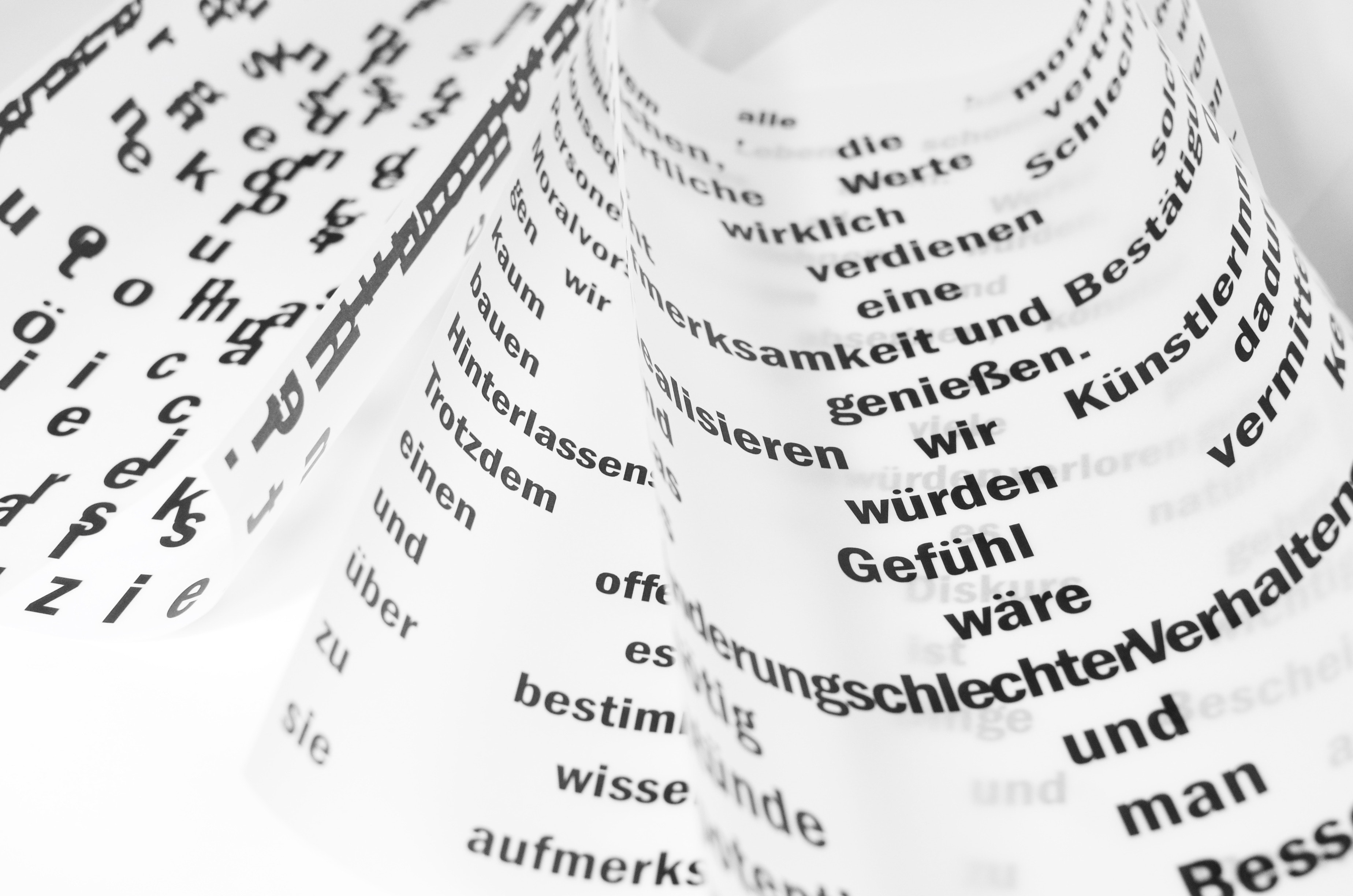
When you have a lot to read, typography matters. That’s why meny bloggers and articles recommend to use tidy font in your resume. The service I was working on had filled with text and numbers. I didn’t want it to be nasty. GUI designer, Chealin Kwon and I had selected best font for the service.
- Overview
- What was the problem?
- How I solved it?
- What I’ve learned?
Overview
Goal Make service faster by using a minimum amount of scales of the font.
Team members Project lead: Tiara Shin Assist: Chealin Kwon
What was the problem?
Money Station service is text heavy financial SNS. We just launched a Beta service. The loading speed of the service reached more than 20 seconds.
I counted all the typography styles in the service. The results were good enough to persuade all the members why we should working on the font.
We were using 13 scales of ‘Noto-SansKR’ with 6 weights, 5 scales of ‘SanFransisco’ with 3 weights, plus two types of ‘system UI’.
How I solved it?
-
I had to know that the fonts we were using are suitable for the service.
-
Legibility is an absolute must. SanFransisco is a basic font used in IOS. For the user who doesn’t have an IOS device, they can see another font. I want every user can get a similar experience of the service. Therefore we need a general font both for IOS and Android.
-
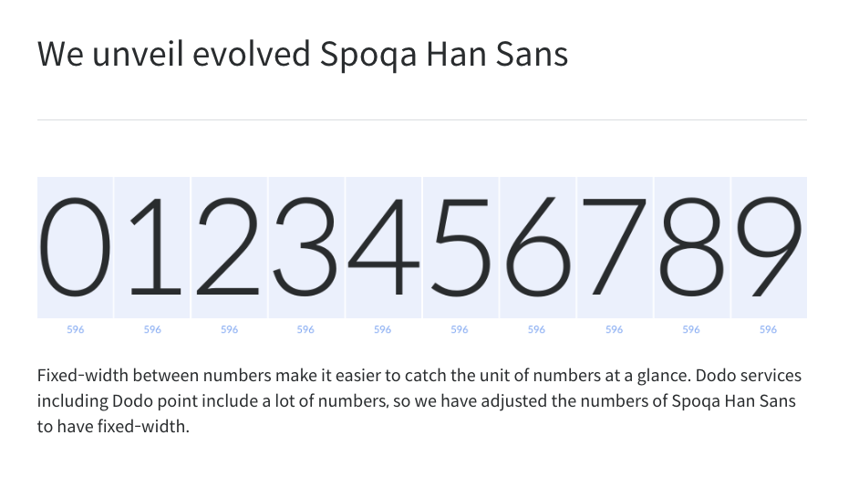
Number characters should have the same fixed width. It is a financial service. It has lots of numbers. We found that sometimes bigger number look smaller because of the different width of 1, 4, 8 and 0.
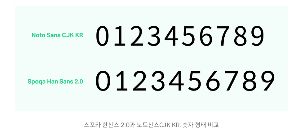
- It should be lightweighted. Korean fonts are usually huge. Noto Sans KR has 11,172 characters in total. Spoqa Han Sans has 2,350 characters in total. It is more suitable for web service.
-
-
Compare possible font.
I compared numbers and paragraph of every possible font. Chose best 4 fonts among many others.
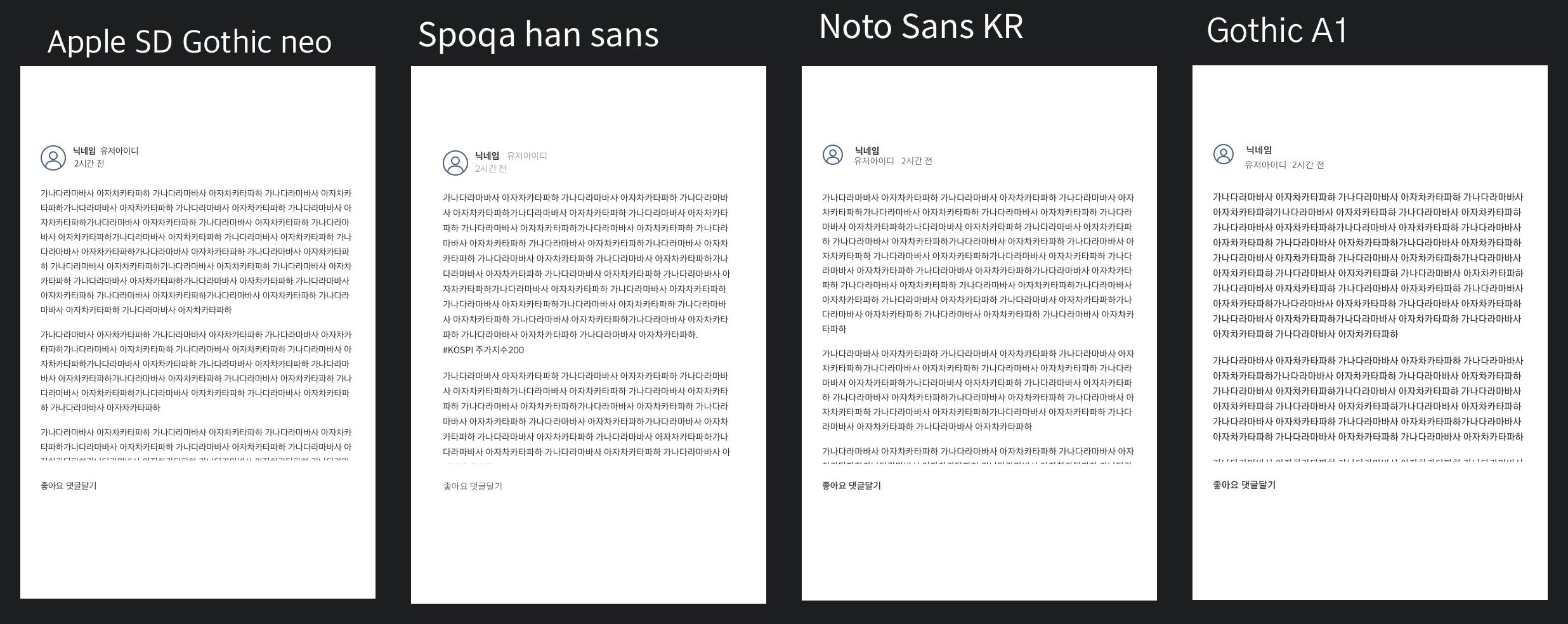
Among those, Apple SD Gothic neo and Spoqa Han Sans were top 2. Our competitor uses Apple SD Gothic neo so we decided to use Spoqa Han Sans.
-
The result
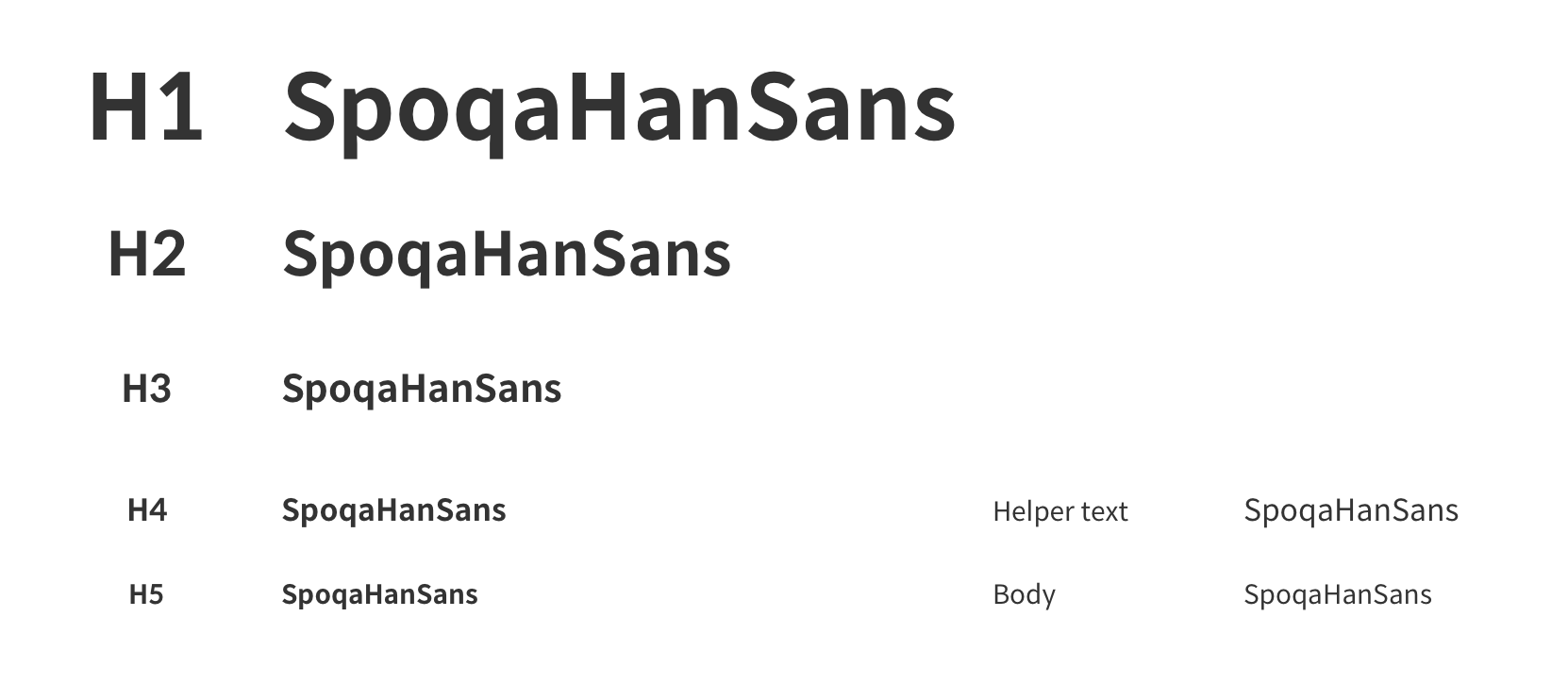
I used the smallest number of scales and two weights. Yes, we did it. You can check the result at www.moneystation.net.
What I’ve learned.
Typography is a big thing. Designers convey their insights by using typography. Each type has tiny little differences. That makes all the differences. It may not look important. But it affects huge aspects of service. By organizing and reuse a certain amount of font, we were able to reduce the load time to 16seconds. It was a huge project than I expected but worth it.
Explore more like this
Keyding - UI design
Can you build an application with beutiful, high end application without well planed UX design? If you are making service without plan, it can be a disaster. Basic is always...

SKT usability test
The most exciting activity I had with my friends is this user research project. It was just 4 days journey, but good enough to blow my mind.
Comments