
SKT usability test


The most exciting activity I had with my friends is this user research project. It was just 4 days journey, but good enough to blow my mind.
- Overview
- What was the problem?
- How I solved it?
- What I’ve learned?
Overview
Goal Find out the problem of the membership service in skt mobile app.
Team members
- Prepare Interview and write the test: Tiara Shin
- Moderator: Teri Kim
- Data organizing: Yongmin Kim
What was the problem?
There are three major mobile carriers in Korea- KT, SKT and LG Uplus. KT got a mobile award and we were curious about other carrier services. My friends and I were using SKT and KT. So, we decided to do some user test of SKT.
How I solved it?
It was 4 days of the journey.
Day 1. Use the app
We use the app in our own way to find out is there any usability issues. Followed by categorizing the issues we found.
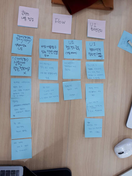
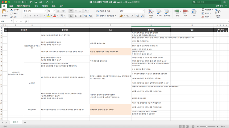
Day 2. Prepare the interview
Based on the categories, we ended up to three major questions.
-
Can you find the membership barcode?
-
Do you know how much points you can use more?
-
Where can you use your membership? Can you find any further information in the app?
Day 3. Pilot test
We invite friends and offers a cup of coffee. At the same time, as we did an interview using the question sheet and records it as if it is a real teat.
We did only one pilot test but it actually helps a lot. We changed the order of the questions in detail, add more suitable questions and delete some of it.
Day 4. User-Test and wrap up
We set a small lap. Put two desks and chairs. Above the desk, set up the place for phone and camera. One friend moderate the test, I write down the answers and the other friends ask the moderator to ask an additional question when it is necessary.
Before the test, we get permission to record the process. Also, we explained to the participant that this test is solely for R&D purpose.
We did three times. Each test took around 15 mins to half an hour.
This is the video we took during the second user test.
Findings
It seems vague about what major problems are. But we ended two main findings.
- Need to show clear lines between Tmembership app and Tworld app The same function under two apps makes unnecessary confusion to users. Beginning from the tworld app, many users were ended up outside of the app. It can be web pages, Tmembership app or direct call to a service centre.
- Need to improve personalize Users want personalized information about their membership points and usage. However, neither Tworld app nor T membership app provides information users want.
Solutions
- Cut down the way to reach barcode. Through the Tworld app, users were using the barcode only in Tworld app regarding their membership. Make it clear where the barcode is will enhance the usability of the app. It can be using the barcode metaphor upper side of the main screen or elsewhere.
- All the other functions of membership except the barcode should move to Tmembership app and make Tmembership app more personalized. The company already has a separate membership app. Membership information is information which needs to be personalized. However, even in Tmembership app, users can’t get personalized information. To make the better user experience, focus and show information only related to user’s membership status.
What I’ve learned?
The company already has a separate membership app. Membership information is information which needs to be personalized. However, even in Tmembership app, users can’t get personalized information. To make the better user experience, focus and show information only related to user’s membership status.
It was the personal group project we did ourselves with the help of our mentor. Three participants use the app in three different ways. Actually, just observing how they use the app in all different ways are actually amused me and interesting indeed. It reminds me of the saying, user never use the app the way designers design.
Explore more like this

Text heavy web service and Typography
When you have a lot to read, typography matters. That’s why meny bloggers and articles recommend to use tidy font in your resume. The service I was working on had...
Keyding - UI design
Can you build an application with beutiful, high end application without well planed UX design? If you are making service without plan, it can be a disaster. Basic is always...
Comments