
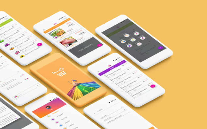
Keyding - UI design

Can you build an application with beutiful, high end application without well planed UX design? If you are making service without plan, it can be a disaster. Basic is always important.
- Overview
- What was the problem?
- How I solved it?
- What I’ve learned?
Overview
Duration: May 04 ~ June 04 Client: Keyding Digital agency: Practico Target Device: Android Galaxy note 5
Goal UI Design for an android app based on the wireframe and concept
Team members
- Executive Director: Sanghee Byeon
- UI design: G.Tiara Shin
What was the problem?
When I first saw the wireframe, I didn’t know whether to laugh or cry. We couldn’t figure out what is this app for and what the main features are.
A Request for Proposal(RFP)
- Own icon set around 50 icons
- Funky and bright mood and tone
- Improving UI not changing the flow of the wireframe. At the time they requested this project, most of the development process was done.
Problemes of the wireframe
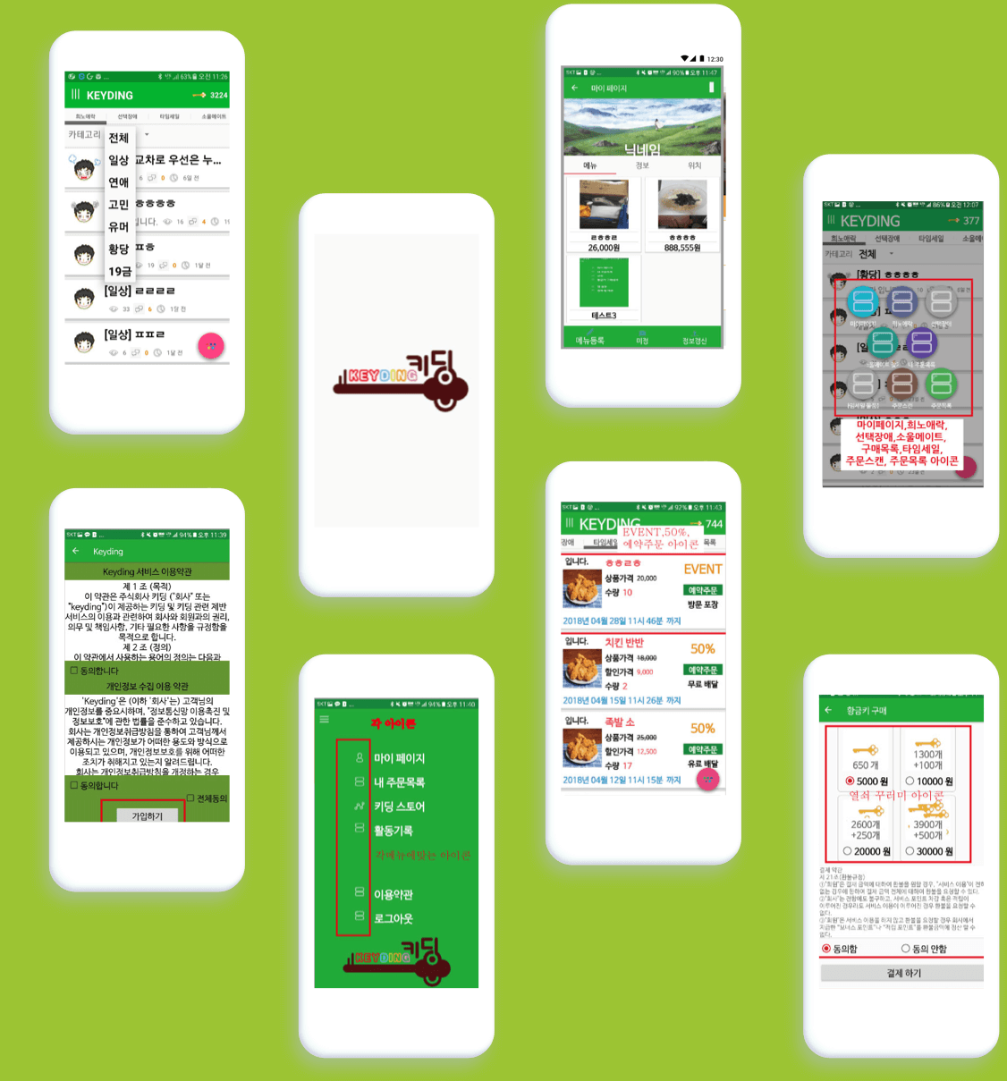
- Information Architecture was unclear. It made hard to figure out the features of the app.
- Irrelevant features make unnecessary confusions. The main purpose of the app is connecting restaurants to people. By doing that, restaurants can sell their foods near due date at a discounted price. However, two third of the screens are for Soulmate features where people can find mates.
- Others Unnecessary tabs, too many texts, gathering unnecessary personal information, the way they display the information, and so on.
In order to proceed GUI design process, we needed to set up a brand identity first.
How I solved it?
- Set up the brand identity and propose several concepts Logo, App Icon, main colours and Fonts
- Confirm the wireframes Main features, buttons, hierarchies and size of each content.
- Do design Characters, screens and Business cards
- Provide the design guides and outcomes
Brand Identity
According to the client, their service name, Keyding is a combination of Key and Kidding. We started from here.
![]()
Point Colors
This app will have many images of food. For this app, I can’t think other colours but orange. Because the colour orange stimulates the appetite. The colour is perfect for this app. We just wanted to use Orange for point colour, but the client wanted more colours for the funky tone of the app. Hence, here are two other colours; green and purple for vibrant and funky mood.
Fonts
The ideal target of this app is young singles in their 20s to 40s. Also, this app will have lots of contents to read. we wanted to keep it as simple as possible. We use two types of fonts, ‘Nanum Gothic’ for general use and ‘Swagger’ for the Headings.
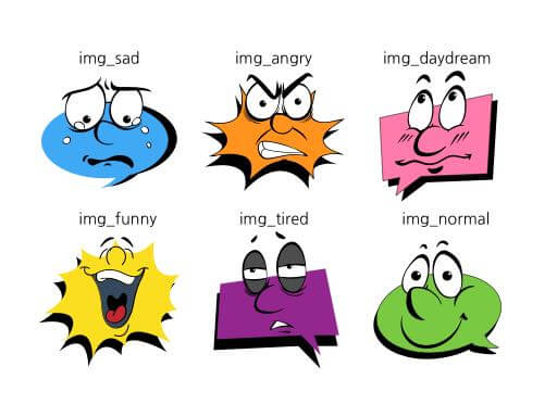
Characters
Inspired by comic book, tried to exaggerate facial emotions.
What I’ve learned?
It was my first project as a UI designer. The development process progressed a lot and the client just wanted a slight touch of designers. As I studied UX and knows how it affects the success in business, I tried my best to enhance the potential user experience by changing locations of buttons and information considering which one is more important and what information need to be shown first. I tried my best in the boundaries I can change, and some are accepted. Probably it would be the most part UXers and UI designers are facing, and my journey continues.
Explore more like this
Text heavy web service and Typography
When you have a lot to read, typography matters. That’s why meny bloggers and articles recommend to use tidy font in your resume. The service I was working on had...

SKT usability test
The most exciting activity I had with my friends is this user research project. It was just 4 days journey, but good enough to blow my mind.
Comments