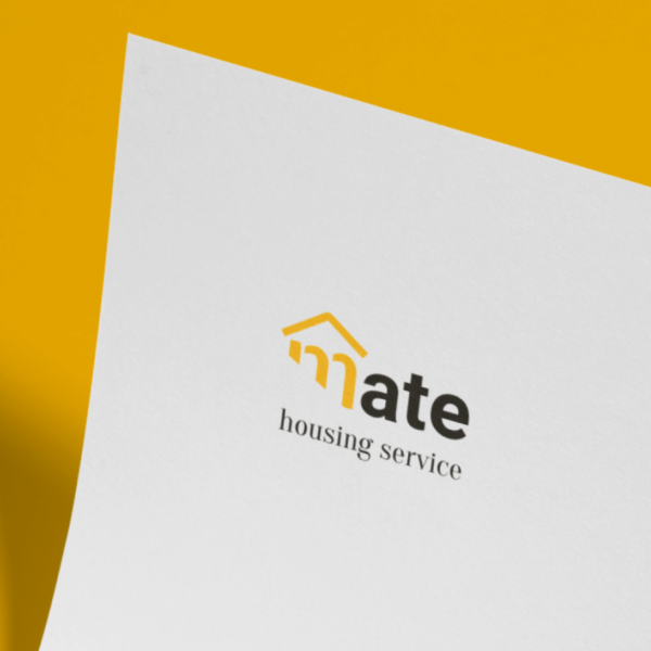
BI for 'mate'
Written by Tiara on

Quick side project.
1. Requirements
‘mate is a startup focusing on housing management service, tiny apartment for elders. They don’t have an office. Instead, they are working on their website. They need stationary to inform residents of the service they did or any news to share. They were stressing that they wanted to see as enthusiastic young entrepreneurs. Besides, they wanted some metaphor from the house in the logo. They asked me for a logo used for the website and stationary.
2. Developing
To show that they are bright, young and friendly, they chose bright yellow as the primary colour. Consider that the logo will be used on the website and stationery simultaneously, and I decided among san-serif typeface for readability.
3. Outcome

Comments