Renfe redesign

How work shift screen can be more user friendly? Target device : Galaxy Tab S7.
Overview
I had a chance to talk to one of the train drivers in Renfe over this particular application for the train drivers. Renfe is Span’s rail carrier company. With 5,000 trains running every day in Spain, more than 500 million passengers a year, about 15,000 committed employees are proud of their work and the most exceptional punctuality, quality, and satisfaction. To guarantee the punctuality and efficiency of work, Renfe started to communicate with train drivers through a tablet device. This application’s primary purpose is to let train drivers know their work schedule and give information about the train they need to drive.
What was the problem?
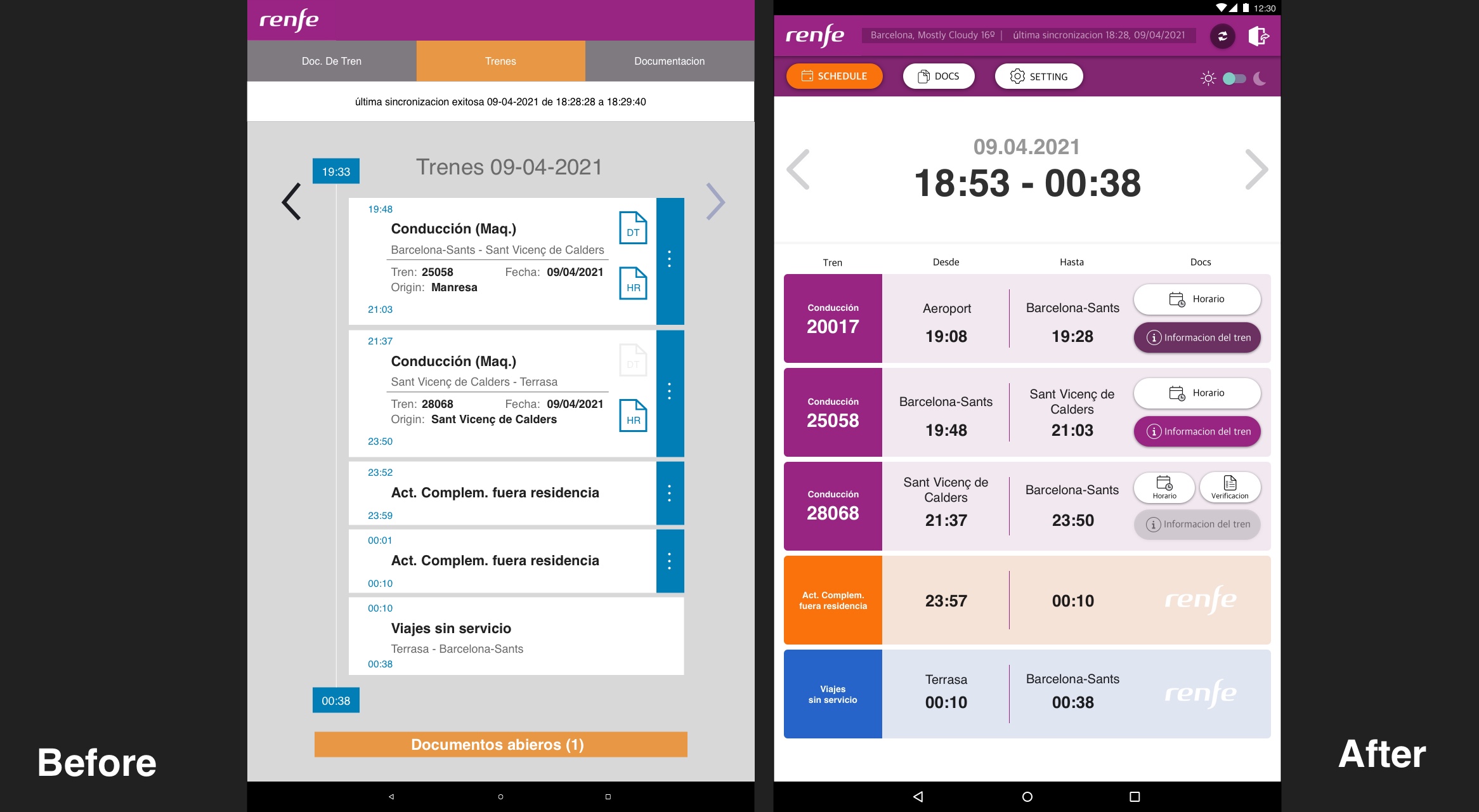
Train drivers have different schedules daily, and the application has some issues. I noticed several technical problems such as, once you reach the bottom, you can’t go up because the scroll bar does not appear, Some minor numbers are wrong due to the incorrect data, and so on. However, I solely focus on this screen’s UI perspective.
- too many icons on top distract eyes which are used rarely.
- Documents of train and train schedule share the same icon.
- They are counting the documents already read instead of which need to be open
How I solved it?
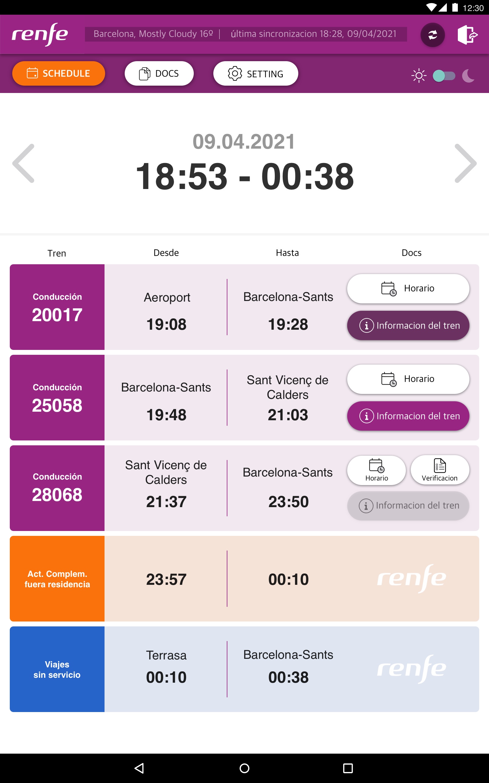
Based on the purpose of this application, I focussed on the features. Which are the schedule of work (when the shift starts and finish), What they should do (drive the train, move the train or just travel), which documents are updated, read and not available and give extra information of weather and reduce the fixed height of the top area of the screen.

1) Leave the most frequently used icons only and adjust the header part.
- Sometimes, unexpected accidents can happen, and information such as the train number, departure time, or things can be changing. Usually, the documents regarding each train are updated 30mins before the departure of the train. Therefore, the refresh or sync button is essential. And at the same time, the information when the last time synced can be significant. However, it doesn’t mean that it should keep appearing on there with that vast heights.
- Due to the lights of the times, the next most used icon is changing light mode and dark mode. I changed it to a toggle type instead of changing icons upon touch.
- This information is confidential so put the sign-out button on top.
- I assumed that other icon functions could be found inside the setting menu.
2) Use colors to distinguish actions.
Drive can use the primary color of Renfe, just moving train for Orange, and for the moving without driving is blue.
3) Make buttons bigger with icons matching the text.
Based on the interaction with the users, the button changes its conditions; pressed condition when the document read, disabled to active when the document updated. When it comes to driving the train from the origin station, the verification button appears for check before departure.

What I’ve learned?
It was fun. It was the first time to meet and talk to train drivers. It reminds me of the times I used to work in a hotel. Make a schedule for every workes and controlling, managing all the source can be challenging. By seeing the screen, I could see the company’s requirements and the designer’s struggles. It is just a side project for fun but a fantastic time to interview a user directly and find the needs.
Comments