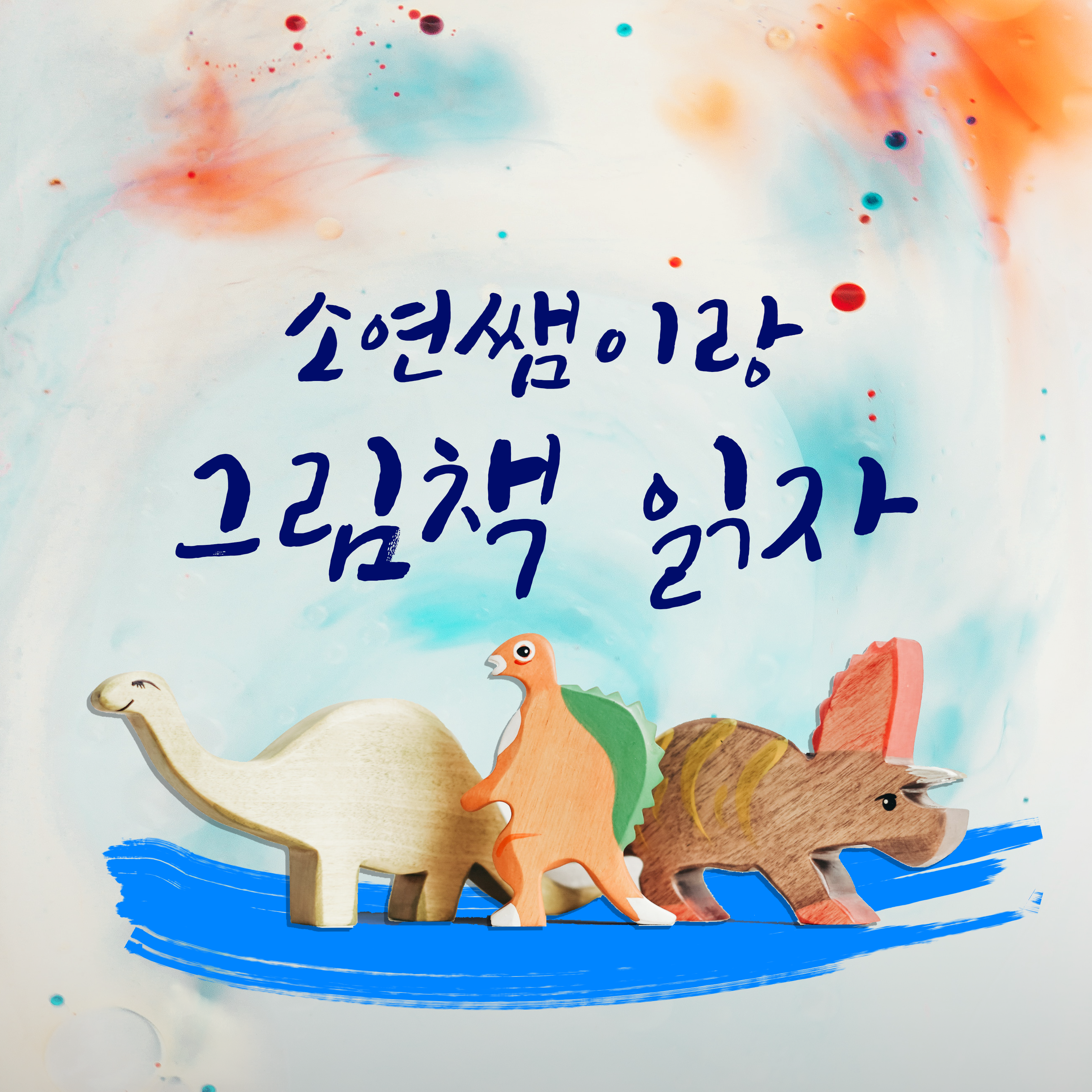
Cover design for new channel in Podcast

1. Overview
Soyounssaem is a Korean language teacher. She is passionate about Korean education for children under 8. She wanted to launch a channel in Podcast. Specifically, she wanted to read good storybooks for children who are starting to learn Korean. Many parents are busy and don’t know what the best books for their children are. Her podcasts choose a book, read and suggest extra activities which parents and children can enjoy afterwards.
2. Developing
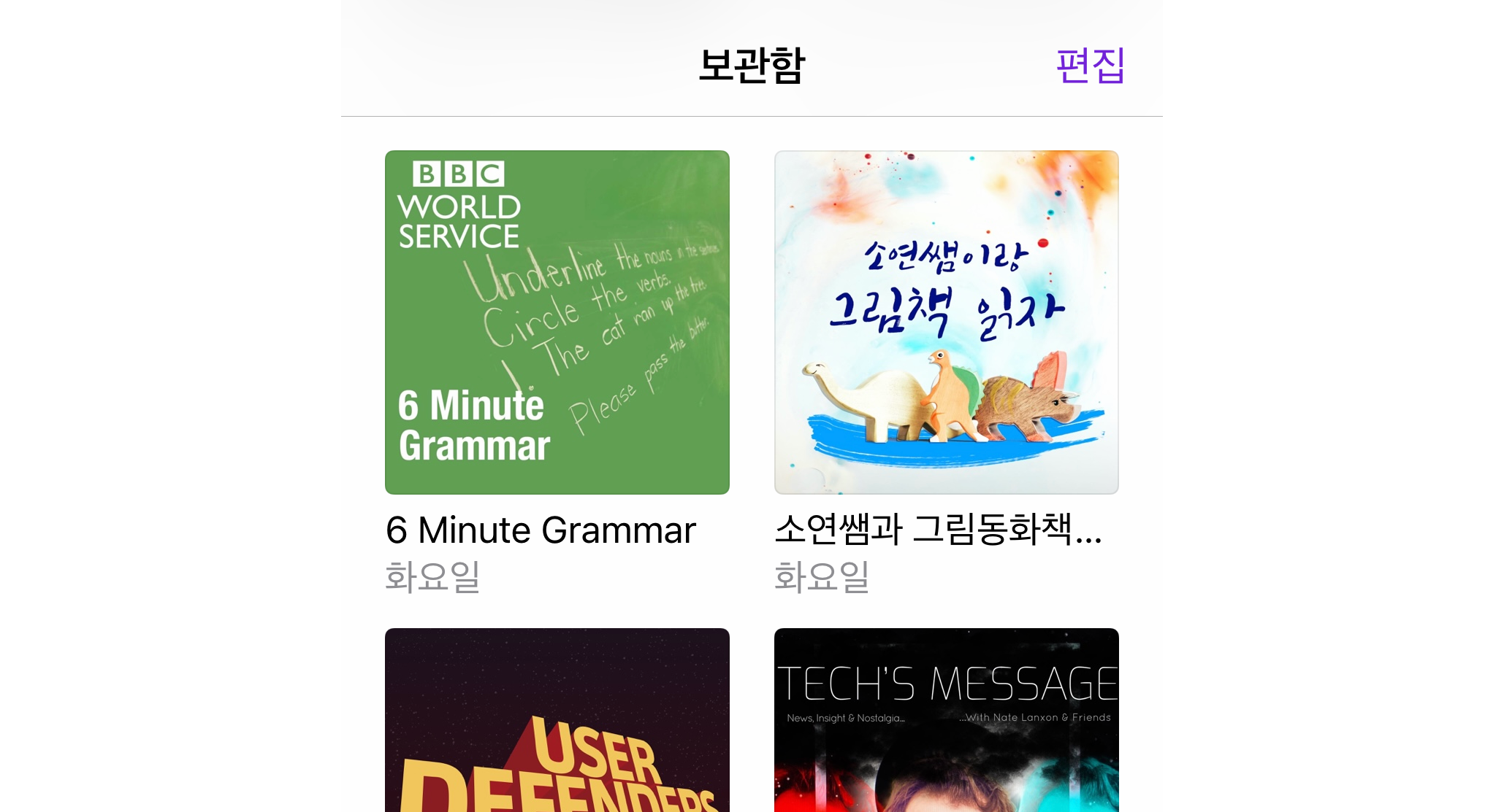
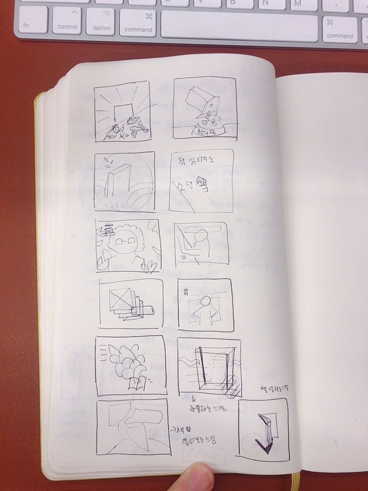
The main target is a family with young children, and there was a need to stand out among all the other covers in the podcast. Most of the podcasts covers are filled with massive typos and using the colour red or colour with high contrast. But she wanted her podcasts to look more like a cosy atmosphere and intrigue creativity.

3. Outcome
Here is the outcome. It is using multiple gradations of colours and texture, and toys. See how it looks.
 Besides, if you are interested in the podcast, here is the link.
Comments